|
Art
A Questionable Time
Nader Rahman
 Group exhibitions are usually approached with trepidation, one need not find like-minded artists, but if their work underlies a common theme only then they can be justified. This is often overlooked in the Bangladeshi art scene, curators habitually scrap and scrape together artists with fresh portfolios and hastily arrange physics/cosmological named exhibitions. Time, space and the spirituality in between are never far from the titles of these ubiquitous exhibitions. At any point in time there a few of such exhibitions doing the rounds, all I have to say is curators of Bangladesh unite, you have nothing to lose but the omnipresent patchwork that defines the current group exhibition scene. There is no artistic safety in numbers as I imagine they think. There are better alternatives. Group exhibitions are usually approached with trepidation, one need not find like-minded artists, but if their work underlies a common theme only then they can be justified. This is often overlooked in the Bangladeshi art scene, curators habitually scrap and scrape together artists with fresh portfolios and hastily arrange physics/cosmological named exhibitions. Time, space and the spirituality in between are never far from the titles of these ubiquitous exhibitions. At any point in time there a few of such exhibitions doing the rounds, all I have to say is curators of Bangladesh unite, you have nothing to lose but the omnipresent patchwork that defines the current group exhibition scene. There is no artistic safety in numbers as I imagine they think. There are better alternatives.
With that tirade out of the way there is no better way to talk of latest exhibition at the Bengal Gallery of Fine Arts. Known for putting on the highest quality exhibitions, its current display lightly soiled its reputation. The group exhibition 'Color of Time' showcased the work of seven mid-career artists and there was little cohesion between its rather abstract title and the works displayed.
 |
| Target we & I, Uttam Kumar Roy. |
Things did not start off too badly with Shahin Akhter Lipi, an art restorer for Shilpakala Academy. Her mixed media series titled 'History' promised much and eventually delivered only if by the skin of its teeth. While there were some compelling pieces such as History 10 which depicted a narrow hazy street with some sculptures, aesthetically it brought much to table much like From History 12 where beautiful old steps led up to an ornate intricate door. Light browns mixed with deep lines of blue caught one's eye as the white washed pillars beside the steps aged gracefully. But others flattered to deceive as From History 8 set a dilapidated door against a broken old wall and aside from a subtle use of gray there was nothing much to write home about. Her work would firmly be called good, but still left a lot to be desired. One redeeming quality was that her work was well suited to the title, Color of Time as every painting captured a moment from the past, from the old doors to the rustic streets and her colour schemes were quite attractive as well.
Md. Zahir Hossain Newton's Fish series in the same room proved to be somewhat of a disappointment. The Acrylic on paper creations were basic to say the least, and it felt as if the artist was out of ideas. The fish was always put in the centre of the picture and the colours edged the animal without really affecting it. Like waves on the beach it seemed as if the colours ebbed and flowed to and from the fish, which would not have been bad if more was done to make something out of the whole scenario. It was about as dead as the fish he was painting.
Md. Abdul Aziz really stole the spotlight in the first room as his water colours brought sophistication and finesse to a room painfully devoid of it. His water colours were elegant with striking female figures and birds. Most were done in a light yellow turning into orange as the sharp featured women took centre stage with kaleidoscopic backgrounds often drawing one's eyes from the centre of the work. Simple, sleek and succinct his turquoise Lady with Bird-6 was one of the genuine standouts of the entire exhibition.
 |
| Image-10, Rajaul Islam Lovelu. |
The exhibition was given a different flavour with Rajaul Islam Lovelu's woodcarvings. A flavour I could have done without as they came across as more 'craftsy' than art. His Lady with Bird is the best case in point, poorly executed this carving is what one might find at a novelty shop. It does have one small redeeming feature as the little bronze and metal inlay representing the sky at night and during the day is beautifully whimsically done. Aside from that the garish colours take precedence over everything else. He does not stop there, as his 'movement of owls' is a sort of cartoon exorcism of protrudingly nipple eyed feathered friends. Pardon the pun but much of his work is wooden. The light at the end of his tunnel is his Image 10, its shredded linearity brings together sleek female profiles. Dark and over bearing it shows what he is capable of.
Syed Mohammad Shamim is 'searching for peace' with his work but will give none to those who view his work if he continues his up and down work which was showcased here. While some pieces demanded genuine attention and brought out his conceptual side as well as a terrific mix of colours, others were perfect for Grandma's parlor as they were capable of putting people to sleep at first sight. Searching for piece 15 was undoubtedly his best as light gray and white merge with a stoic blue. There are mini explosions of yellow and red which add a touch of tension to the prevailing peace he created between the colours. Searching for Peace 14 was a war of colours as not a single inch of the large canvas was left untouched. The mellow war on the canvas was where pastels were forced to cross borders with each other. His other work was timid and embodied anything but the search for peace.
 |
| Lady with Bird, Md. Abdul Aziz. |
Surrealism was openly exploited by Md Mahabubul Islam as his painting Target, as a hawk, a fish, a horse and a runner jumping over hurdle all share the canvas with tentacles hanging over them. What pleased me most about the painting was that the Target was never explicit. The runner was surely running to win, but face was calm and collected as every sinuous muscle in his body was focused on getting past the next hurdle. The face of the green runner did not care for the target, yet the body had a 'mind' of its own. Simultaneity-1 and 2 really sum up the exhibition for me. While 1 was a blue wonder with ships moored in the background and a lady with a body of boxes. The light blue tint of the picture really gave it depth, not quite sad, but a light blue. While 'Simultaneity-2' was an orange disappointment with a poorly drawn female figure dominating an average scene bathed in a tasteless shade of orange. 'Life Cycle' was another curious case and seemed too literal for my taste.
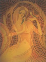
Uttam Kumar Roy was the youngest at the exhibition and in many ways seemed the most accomplished of all the artists. His large canvasses took one through time and space and left one feeling weightless, almost like the inside of a womb. His pen and ink visions of the world showed great talent and skill as each canvas was flawlessly presented. The only complaint is that he tends to be repetitive as 'Target we and I', 38 to 41 are all quite similar. But his circuit board faces really add a different dimension to a rather mundane exhibition, along with cell like floating forms often filled with spiders and their webs. The Globules are seemingly connected by a translucent membrane which also very loosly binds all the elements of the painting. Keeping it close knit and yet still weightless.
Over all the 'Color of Time' was below average and poorly titled. I am still searching for the link between the colour of time and the seven artists and have come to a conclusion. If you wish to have a questionable time, then go see this exhibition, as for the colour part, I still have not figured where and what that is for.
Copyright
(R) thedailystar.net 2008 |