|
Exhibition
Designing for Peace
Tamanna Khan
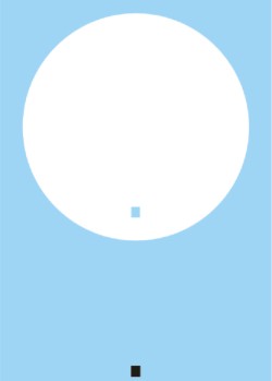 |
“Gravity” by Mishuk Datta awarded with the Hiromi Inayoshi Award. |
“Little Boy” weighing about four tonnes, three metres in length and 0.7 metres in diameter destroyed the entire city of Hiroshima on August 6, 1947 killing almost 1.4 million people. Sixty-three years later the post-war generation of Hiroshima still suffers from various types of birth defect caused by the radioactivity of that one single atomic bomb. Dr Muhammad Yunus, speaking at the award giving ceremony of Conqueror Corporate Identity Design Contest 2010, Bangladesh, sadly observes that more than fifteen thousand nuclear bombs, thousand times powerful than “Little Boy” awaits explosion at different corners of the Earth in the name of saving mankind. How many times do the people who advocate the necessity of nuclear bombs plan to destroy our mother Earth? He poses the question before the audience, the jury and the contestants present at design contest hosted by NPO Earth Identity Projects Japan and Paper Studio Bangladesh in collaboration with Bengal Gallery of Fine Arts, where a five day exhibition on the winning designs and works by world renowned artist of logos, insignias, marks and corporate identity, Hiromi Inayoshi will be held. The theme of the design contest has been “True Peace-a world without poverty, world without nuclear weapons” and it brings together great minds from the two countries Bangladesh and Japan, each being victim of the two of the evils of the world namely poverty and nuclear weapon, to allow the new generation to express their inner thoughts on the theme in beautiful Conqueror papers. The Conqueror Corporate Identity Design Contest has been held previously in 2005 and 2007 in which participants from Japan, Korea and Taiwan designed symbol marks on themes like Aging Issue and corporate identity for a school at Sylhet, established by NPO Earth Identity Projects. This year the contest has been arranged in Bangladesh by Paper Studio, sole promoter of Conqueror papers in this country, thus offering Bangladeshi artist and graphic designers an opportunity to demonstrate their talent at international level. Other than the set theme, designers have been encouraged to submit symbol marks or logos on the free theme, which they may have created for a local or international body.
On June this year, Hiromi Inayoshi, the master artist in this field, has conducted a daylong seminar for students and professionals who showed interest to participate in the contest. The contest was declared open on June 7, 2010 and the contestants had a total of 28 days to prepare and submit their designs. A distinguished panel of jury that included Nobel Laureate Professor Dr Muhammad Yunus, Steven Leeper, Chairperson, Hiroshima Peace Culture Foundation, Japan, Geeteara Safiya Choudhury, leading advertsing personality, Architect Bashirul Haq, Luva Nahid Choudhury, Director General of Bengal Foundation, Tamara Abed, Head of Aarong and Brac Dairy, and Hiromi Inayoshi, the master artist of mark design, selected eleven designs out of 110 submissions. The eleven awards include three gold, one Hiromi Inayoshi award, one silver and six merit awards.
 |
Dr Muhammad Yunus delivering a speech at the inaugural of the
prize giving ceremony. |
A student from Shanto-Mariam University of Creative Technology, Abul Hashem Bappy received the gold award in the set theme for his work “Peace Bird”, which presents a drawing of a flying bird in red ink on a white background. The free-flow of the bird is visible in every aspect of the drawing emphasizing the relationship of freedom and peace. For Bappy, this the first time he has taken part in any contest and he believes that this type of contest provides exposure to amateur designers of our country. Gold winner in professional category for set theme, Shalim Hossain Saju, from Bitopi Advertising Ltd has presented “True Peace” through a blue dot dissolving in a white background, that he named “Eye and Earth”. He depicts the never-ending quest for peace through his design where blue represents peace and the white, eternity. The design also offers an illusion if the beholder stares at the dot for a long time; the blue dot disappears after sometime leaving only a vast emptiness, which means that absence of peace leaves nothing but the pain of bareness. M A Raihan, a freelance artist received the gold award in the free theme category. He has designed a logo for Jamie Fashion and relates the story behind it: “I had prepared this for an Australian photographer, which for some reason he did not accept, so I later modified the design and his name and submitted it for the contest.” Raihan also received a merit award for another of his work in which he used just two colours; green and white. In a green circle, three human figures in white are in postures of joy depicting delight in a nuclear bomb free world. Raihan says, “I got the inspiration on working at such a minimalist form from Inayoshi. I was fortunate enough to be able to talk with him personally for a long time and learn about his views on this type of work.” Mishuk Datta, a student from Architecture Department of Bangladesh University of Engineering and Technology received a special prize named “Hiromi Inayoshi award” for his work “Gravity”, which presents a white circle in blue rectangle, depicting earth and hope respectively, and from the white circle a small black square representing nuclear weapons has been removed. Mishuk says, “There is a relationship between graphic design and architecture, both work with the emotion of human. I developed interest in graphic design from the time I started studying architecture.” Through his work he wishes to scratch away the black evil dots on the surface of the earth and bring about a new day full of hope.
 |
“Peace Bird” by Abul Hashem Bappy received the Gold Award
under the set theme category among student participants. |
Commenting on the works of Bangladeshi artist, chief judge Hiromi Inayoshi says, “Compared to Korea and Taiwan in the past contest, Bangladesh was outstanding in terms of standards.” About Mishuk's work, the maestro says that he was impressed with the ideas and philosophy conveyed in his design. Further more, Mishuk has been able to come up with a simple and modern design, which is quite unexpected from an architecture student. The Gold award winners in the set theme category and Mishuk will receive the opportunity to visit Hiroshima to experience the true meaning of the destructiveness of war and the endeavour for peace.
Along with the winning entries, which are nicely framed and aesthetically explained through rectangular boards, the inner halls of Bengal gallery exhibits the works of the master himself. His logo for Dr. Yunus's social business as well as a personal mark for the Noble Laureate, along with about 15 symbols adorn the gallery walls in large frames.
Inayoshi has used two adjoining circles to represent social business; it is a concept of two, which can be explained in many ways including man and peace. The circles also gives the illusion of butterfly or a petal fulfilling the aesthetic aspect of a mark; the number eight which represents revival and resurrection; and most importantly the S and B of social business. The personal mark of Dr Yunus that almost looks like an upright crane in green calligraphy proudly hangs on the wall along with the personal marks of the King of Thailand and other celebrity figures. The winning entries of previous Conqueror Corporate Identity contest are also on display in the exhibition.
Copyright
(R) thedailystar.net 2010
|