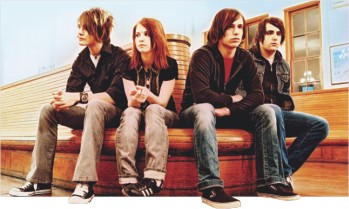

Paramore
POP/rock outfit Paramore began humbly enough in Franklin, TN, when lead singer Hayley Williams met brothers Josh and Zac Farro (guitar and drums, respectively) after moving into town from Mississippi. The two had a young band that the burgeoning singer was soon asked to join. Opening Williams' 13-year-old eyes to the likes of U2, the Cure, Sparta, and Failure, the teenagers began performing together under the name Paramore following the addition of Jason Bynum on rhythm guitar and Jeremy Davis on bass. Local hangouts and a school talent show helped the young bandmembers hone their chops before at last moving up to gigs at area rock clubs. The quintet's sweet melodies and earnest charisma eventually caught the attention of Florida's Fueled by Ramen label, which signed the band in April 2005. Working with James Wisner (Dashboard Confessional, Underoath) and Mike Green (Yellowcard, the Black Maria), Paramore recorded their full-length debut, All We Know Is Falling. The album was issued in late July 2005, and Paramore jumped quickly into their van to support it. In addition to a spot on New Jersey's Bamboozle Festival and multiple Warped Tour dates, they also played shows with bands like Simple Plan and Straylight Run. Hunter Lamb replaced Bynum on guitar in December 2005; time was spent in the early part of the next year on dates with Halifax, So They Say, and Bayside. Similar to many of their musical peers, summer 2006 was then passed back on the annual Warped Tour circuit. Lamb parted ways with the group in early 2007 to get married, and Paramore continued on touring and writing new material as a quartet. The following spring they recorded their sophomore album, Riot!, with producer David Bendeth and signed a major-label deal with Atlantic.
 Ana Nallick
Her love of the Cranberries, John Mayer, and Fiona Apple is easy to hear when one listens to the poignant music of singer/songwriter Anna Nalick, but it's her beloved Blind Melon that had the most impact on her career. The California native had been recording demos on a cheap cassette recorder when one of her tapes ended up in the hands of former Blind Melon members Christopher Thorn and Brad Smith. The two were now a production team and with Eric Rosse -- a producer who had worked with another Nalick fave, Tori Amos -- they re-recorded her home demos in a professional studio. Two weeks later, Columbia Records contacted Nalick with an offer and soon college was put on hold. With an all-star cast of studio musicians, the 20-year-old recorded her debut, Wreck of the Day, released in April of 2005.

Game Review

By Emil
I don't know if this is the golden age of games, but it's certainly the age where most games, if not all, possess some degree of awesome graphics, innovative gameplay, yadda yadda yadda.
Spark Unlimited, developer of CoD: Finest Hour, and Turning Point: Fall of Liberty. The former a game mostly mediocre and the later mostly crap. They've now come up with Legendary, a modern fantasy game set in the first person shooter genre.
 The story goes that you're a thief for hire, a good one at that. And you've just been hired to steal one of the most powerful and dangerous object on earth. Pandora's Box. No. Not the box itself, but what's inside. Things do not go as planned, and the box decides to let out what it contained- mythical creatures ranging from fire drakes- rocky creatures spitting fire, werewolves to skyscraping golems. The box also decides to imprint a 'signet' onto your left hand which allows a variety of use, not limited to absorbing the life essence of these creatures for yourself. As far as concepts go, Legendary is pretty good. But, as far as execution goes, Legendary is pretty bad.
Armed first with an axe, you'll find yourself trying to get out of a ravaged New York with villain goons and mythical beasts dying to take a bite out of your butt. Pun on dying. A british agent helps you out. A girl, obviously- kinda pretty in the cutscenes, and a wrinkled old woman in game. Disturbing, no?
You find new weapons as you progress, to assist in your survival, but it's possible to keep only two guns at a time. Not that what gun you have really makes a difference… The interesting bit of the game is taking out the beasties that are laying waste to the city. A werewolf won't die unless you hack off its head. And the nesting grounds of firedrakes have to be doused with water if you don't want to bug by the critters anymore. And then slowly, gradually the annoying bits start to pop up. Objects are placed extremely convenient places, EMPs falling apart into three parts and magically being scattered in the subway even though it was outside in the air, with a crashing helicopter just moments ago, double agents conveniently having intricate arcane insights and so on forth. At every turn you'll stumble onto an anomaly that just destroys the whole atmosphere.
The idea that the whole of New York uses only a single system of locking doors (a keypad, which Deckard can smash open and 'bypass'), be it subways, police stations or sewers- it is mind bogglingly dumb. And what kind of an adult can't jump more than one foot into the air? A professional thief, apparently. Anomalies and annoyances at every turn, at every key stroke makes this an annoying game to play. Hacking off heads, though, is quite fun.
The graphics of a game can sometime be a redemptive factor. But, not for Legendary, with visuals that are at best, mediocre. Why wouldn't you allow us to axe up some poor dead soul on the ground? Hitting anything other than mythical beasts makes a metallic sound ring out which gets annoying, because you're trying to have fun with your axe here… That guy, clearly dead, clearly has no use for that leg right there… Hey, I'm just saying… You don't know when having an extra hand by your side might come in handy. Er… No pun intended. Really. The sounds are nothing to cry yourself to sleep about. No other comments.
In conclusion? Unless you REALLY feel the need to hack off some werewolf head, or EMP off (after finding and repairing one of them, of course) a towering mechanical golem- don't open the box. I mean, get the game. Fun as it could have, interesting as it is, sorta- it's very hard to bite off, and further difficult to chew.
2 out of 5 stars, apples, whatever…

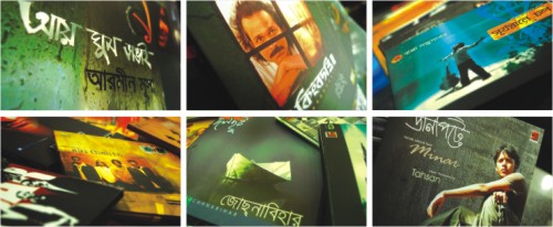
By Sabhanaz Rashid Diya
Photos: Zabir Hasan
The relationship between art and music is a love-hate patch. At any one period, they sing along the same tune; while in the other, you find them tearing each other's hairs out. The very fact that our music needs to wear clothes designed by some of the finest graphics gurus that this world has to offer may seem like an inconspicuous detail we all like to overlook. But the truth remains that album art, in itself is an industry without which our music may have lacked that kick of art that flirts with our eyes.
History of Album Art
Although Alex Steinweiss is often hailed for pioneering the very concept of album art, its origin dates back to 1910 when 78 rpm records replaced phonograph cylinder as the medium for recorded sound. The 78 rpm records were issued in both 10 and 12 inches diameter sizes and were usually sold separately in brown paper or cardboard sleeves that were sometimes plain and sometimes printed to show the producer or the retailer's name. German record company Odeon pioneered the 'album' in 1909 when it released the "Nutcracker Suite" by Tchaikovsky on 4 double-sided discs in a specially-designed package.
Beginning in the 1920s, bound collections of empty sleeves with a plain cardboard or leather cover, similar to a photograph album, were sold as 'record albums' that customers could use to store their records. In 1938, Columbia records hired Steinweiss as its first art director. After his initial efforts at Columbia, other record companies followed his lead. By the late 1940s, record albums for all the major companies featured their own colorful paper covers in both 10-inch and 12-inch sizes. Some featured reproductions of classic art while others utilized original designs.
In today's world, album art consumes of an important ritual in music culture. As a marketing tool and an expression of artistic intent, gatefold covers and inserts (often with lyrics) have made the album cover a desirable artifact in its own right.
When the Brush Strokes Cash
It is no jaw-dropping surprise when one hears of names of famous artists who have gained international accolade through designing album sleeves. The designer company, 'Hipgnosis' with its sleeve genius Storm Thorgerson is a brand amongst many. Designing album covers for Pink Floyd, AC/DC and other 'gods of music', Thorgerson has been on the field for nearly three decades. Bands don't always agree with his ideas. Notably, Pink Floyd picked the prism design for “Dark Side of The Moon” over a much more ambitious concept involving a silver surfer riding the tube of a huge wave. The album has sold more than 40 million copies, so the band must have had a point. Thorgerson was paid a flat fee of 600 pounds, but insists he has no regrets. At an interview with The Sydney Morning Herald, the 64-year old designer says, “Being a graphic designer is not exactly a passport to financial riches. My satisfaction is from working with bands and the fans when I meet them.”
While many may conclude his words as a flattering modesty with references from the likes of Roger Dean (famous for his Yes and Greenslade covers) and Cal Schenkel (known for Captain Beefheart's “Trout Mask Replica” and Frank Zappa's “We're only in it for the Money”), one cannot help but wonder whether making music look good as opposed to sounding good is indeed an understated art. Whether listeners and customers truly look at the sleeves before picking out a record or whether it's just another bonus that comes unappreciated.
The debate is often left to the music buffs, but international media and orthodox masses have often reacted violently to many album sleeve designs. The noted few would be Jimi Hendrix's “Electric Ladyland”, Scorpions' “Lovedrive”, Guns N Roses' “Appetite for Destruction”, Nirvana's “Nevermind” and Aerosmith's 'Nine Lives”. Many designs have often been replaced by plain white paper to avoid controversies and Matchbox Twenty was even sued by Frank Torres for using his photo on their album cover. Surprisingly, labels and bands are also accused of promoting the wrong message through offensive portrayals of different things through album art.
Album Art in Bangladesh
While raising hailstorms in first-world countries across the globe, album art has also raised eyebrows within our local masses over the past decade. After the multifaceted musician Ornob designed the sleeve of his second release, “Hok Kolorob” himself, album art has held an esteemed proportion of thought amongst ardent listeners and new age artists. Be it a classy portrait of the voice inside, random group photos spaced out irregularly or a simple artwork in vibrant orange; album sleeves do catch attention amongst critics and buyers equally. Whether it influences them on picking a particular album from many is undecided, but it certainly creates a buzz amongst the fans.
“It feels good when you see an album that comes with a design you want to keep on your desk,” says 19-year old Ekram. “The fact that the band has put attention to details like creating a sleeve that catches eyes shows that the band has also put a decent effort in its music. The album is then definitely worth a few minutes of play time!”
So, what is it about a cover that makes it memorable? The Watson Brothers' debut release “Ohom” came with a simple design on a light brown background. Yet, it is hailed as one of the classics of sleeve designing by youths who think more about music that just letting it beat their eardrums. Notably, the most anticipated releases of 2008, Black's “Abar” and Authorhin's “Aushampto” have both come with unique art on their cover. “Abar” came with a sleek red-and-black layout with awareness against music piracy while the latter took a chalkboard formula, haphazardly arranged in style.
“If I'm a fan as such, I will purchase that artist's releases, even if it comes with a poor album art,” argues out 21-year old Ayesha. “However, the good design does work like a bonus. It doesn't decide what I'm going to buy, but if it's from a new artist I've not heard before with a fancy album art, I think I will be influenced enough to give that guy a shot! In a way, it tells me the artist comes with a taste!”
Thus, whether it's the design that at all helps an artist make his or her way to your play list is a 360 degree debate that will eat up an entire issue of RS. It perhaps doesn't help one decide, but it certainly plays a role when it comes to newbie in the music field. One of my personal favorites in sleeve designing comes from Sayan's pitch-black album cover. Its simplicity was so striking that I picked it up from the many records that were in front of me and gave it a shot. I have not been disappointed by her soulful voice either. Endorsing Ayesha's remark, a good album cover indicates an artist who has an equal understanding of music as well as art, and will leave our heart thumping to the beats of both.
Sources: Wikipedia, The Sydney Morning Herald